Opt‑in flow redesign leading to a 60% lift in conversion
After 3 rounds of A/B testing, we improved a low‑performing upsell by simplifying the design and pricing.
Project
Opt-in flow redesign
Team
PM - legal- Marketing
Role
Product Designer
Year
2024
Timeframe
3 months
The Problem
An Opt-in flow with a low conversion rate
I was working on Noa, a tool designed to help French businesses complete their mandatory workplace risk assessment (Document Unique).
The tool was offered through three different sales flows through partner health services.
The opt-in flow delivered the lowest conversion rate, posing a clear business risk for one of Padoa’s key revenue streams.
The PROCESS
3 rounds of A/B Testing
We ran 3 rounds of A/B testing over ~3 months, with a clear focus for each iteration. Each variant required quick legal and marketing validation and had to be tested early due to the highly seasonal usage window.
BEFORE
The original design
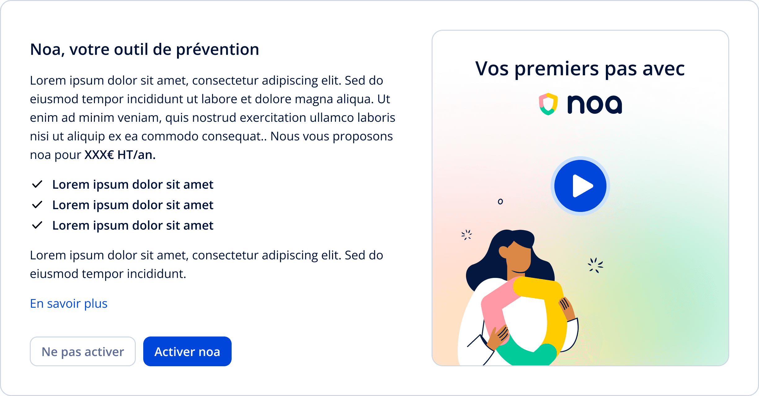
the problem
This design looked like a promotional banner. It was too heavily branded and disconnected from the rest of the page.
ROUND 1 OF A/B TESTING
A cohesive UI leads to higher conversion

What We Did
We redesigned the card to match the layout and visual rhythm of the other cards in the flow.
Results
+2.17pts conversion
(13.8% vs 11.6%)
Statistically significant (p = 0.024)
ROUND 2 OF A/B TESTING
Lowered checkout hesitation by translating annual to monthly pricing
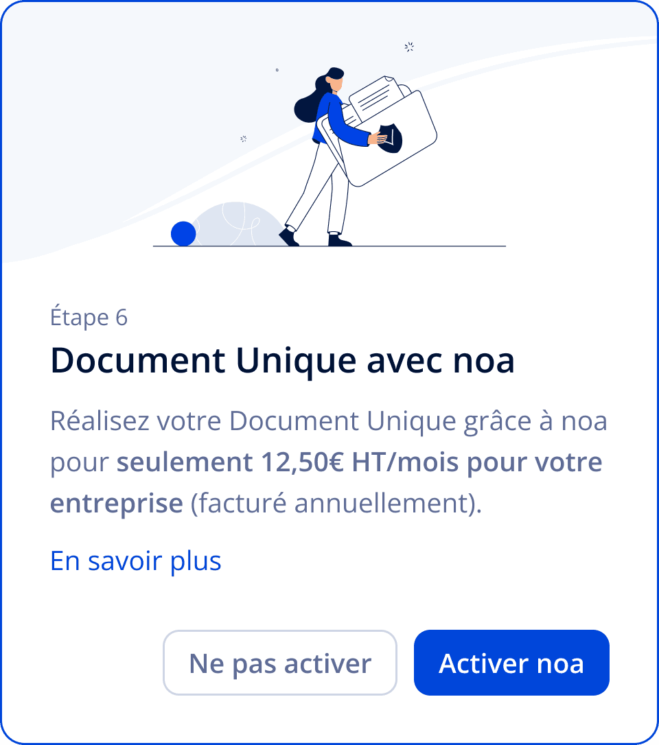
What We Did
Noa is billed annually, but most users are familiar with monthly pricing for SaaS products. The new card displayed the monthly equivalent, with an explicit "billed annually" note to keep things honest.
Results
+3.0pts absolute increase
(12.8% vs 9.8%)
+31% relative lift
Statistically significant (p = 0.0018)
ROUND 3 OF A/B TESTING
Sharpen the copy
What We Did
We collaborated with marketing to rewrite the value proposition using more direct, benefit-oriented language.
Results
+2.5pts increase
20.7% vs 18.1%, but with low sample size
The difference wasn't statistically significant, but the signal was strong enough to justify a re-test next season, when more traffic is available.
key learnings
What we learned
Design drives business
Small UX decisions — visual alignment, pricing format — had measurable impact.
Pricing is perception
Showing a monthly price (even if billed annually) made the offer feel more accessible.
A/B Testing has a window
If your traffic peaks early, your variants need to be ready before launch.
